Notebook
Run it live:
![]()
Download this notebook: 1b_interpretation.ipynb
Interpreting Hydrometeorological Ensemble Verification Results#
This notebook is the second part of the Hydrometeorological ensemble verification tutorial.
In the first notebook, we learned how to configure a verification experiment, run the veriflow pipeline, inspect the resulting OutputDataset, and explore results using the interactive application.
Here, we focus on understanding and interpreting the verification results.
The goal is to understand what verification metrics and statistical criteria tell us about forecast performance, uncertainty, and reliability.
We will explore:
What do the verification metric and statiscal criteria tell us?
How does forecast quality change with lead time?
How well does the ensemble represent uncertainty?
What is the effect of different post-processing approaches?
We will focus on:
Scatter plots: how close forecasts are to observations
Continuous Ranked Probability Score (CRPS): probabilistic forecast quiality
Rank histograms: ensemble reliability and spread
Throughout the notebook, we use discharge forecasts for the River Rhine at Lobith as a practical example.
1. What are we trying to evaluate?#
Forecast verification can answer different questions depending on the metrics/criteria used.
In this notebook, we focus on:
Accuracy: are forecasts close to the observed values?
Bias: do forecasts systematically overestimate or underestimate discharge?
Lead-time behaviour: how does forecast quality change from short to longer lead times?
Uncertainty: does the ensemble spread represent the range of possible outcomes?
Reliability: do observations behave as if they could plausibly come from the forecast ensemble?
These aspects are complementary. A forecast can be accurate on average but still poorly represent uncertainty, or it can have a realistic spread but still be biased.
2. Setup#
We reuse the same case study and data sources as in Notebook 1.
The pipeline is run again here so that this notebook is self-contained.
[ ]:
# Add automatic reloading of modules in case of changes
%load_ext autoreload
%autoreload 2

from datetime import datetime, timezone
import logging

import matplotlib.pyplot as plt
import numpy as np
import pandas as pd
import xarray as xr

from veriflow.configuration import Config, GeneralInfoConfig
from veriflow.configuration.utils import (
    LeadTimes,
    Range,
    TimeUnits,
    VerificationPair,
    VerificationPeriod,
)
from veriflow.constants import DataType
from veriflow.datasources import ZarrConfig
from veriflow.pipeline import run_pipeline
from veriflow.scores import CrpsForEnsembleConfig, RankHistogramConfig
3. Define and run the verification pipeline#
The configuration below defines:
the verification period
the forecast datasets and observation dataset
the lead times
the verification metrics and statistica; criteria
The discharge forecasts were generated by forcing the HBV hydrological model with raw or post-processed ECMWF meteorological ensemble reforecasts.
[2]:
general = GeneralInfoConfig(
    verification_period=VerificationPeriod(
        start=datetime(1988, 1, 1, tzinfo=timezone.utc),
        end=datetime(2008, 12, 31, tzinfo=timezone.utc),
        dimension="forecast_reference_time",
    ),
    verification_pairs=[
        VerificationPair(id="raw_raw", obs="obs", sim="raw_raw", variable="Q"),
        VerificationPair(id="lin_log", obs="obs", sim="lin_log", variable="Q"),
        VerificationPair(id="qqt_qqt", obs="obs", sim="qqt_qqt", variable="Q"),
    ],
    lead_times=LeadTimes(
        unit=TimeUnits.day,
        values=Range(start=0, end=10, step=1),
    ),
)
[3]:
datasources = [
    ZarrConfig(
        general=general,
        import_adapter="zarr",
        source="obs",
        data_type=DataType.observed_historical,
        consolidated=True,
        path="https://s3.deltares.nl/deltares-verification-assets/rhine_dataset_verkade_2013/obs_Q.zarr",
    ),
    ZarrConfig(
        general=general,
        import_adapter="zarr",
        source="raw_raw",
        data_type=DataType.simulated_forecast_ensemble,
        consolidated=True,
        path="https://s3.deltares.nl/deltares-verification-assets/rhine_dataset_verkade_2013/case-raw-raw_Q.zarr",
    ),
    ZarrConfig(
        general=general,
        import_adapter="zarr",
        source="lin_log",
        data_type=DataType.simulated_forecast_ensemble,
        consolidated=True,
        path="https://s3.deltares.nl/deltares-verification-assets/rhine_dataset_verkade_2013/case-lin-log_Q.zarr",
    ),
    ZarrConfig(
        general=general,
        import_adapter="zarr",
        source="qqt_qqt",
        data_type=DataType.simulated_forecast_ensemble,
        consolidated=True,
        path="https://s3.deltares.nl/deltares-verification-assets/rhine_dataset_verkade_2013/case-qqt-qqt_Q.zarr",
    ),
]
[4]:
scores = [
    CrpsForEnsembleConfig(
        score_adapter="crps_for_ensemble",
        general=general,
        reduce_dims=[],
    ),
    RankHistogramConfig(
        score_adapter="rank_histogram",
        general=general,
        reduce_dims=["forecast_reference_time"],
    ),
]

config = Config(
    fileversion="0.1.0",
    general=general,
    datasources=datasources,
    scores=scores,
)
[5]:
logging.basicConfig(
    level=logging.INFO,
    format="%(asctime)s %(levelname)s %(name)s: %(message)s",
    handlers=[logging.StreamHandler()],
)

output_dataset = run_pipeline(config)
2026-06-03 11:44:51,106 INFO veriflow.pipeline: Successfully initialized the configuration.
         verification_period_start = 1988-01-01 00:00:00
         verification_period_end = 2008-12-31 00:00:00
2026-06-03 11:44:51,107 INFO veriflow.pipeline: Start getting data from Zarr.
2026-06-03 11:44:51,237 INFO veriflow.pipeline: Successfully got data from Zarr.
2026-06-03 11:44:51,238 INFO veriflow.pipeline: Start getting data from Zarr.
2026-06-03 11:44:51,252 INFO veriflow.pipeline: Successfully got data from Zarr.
2026-06-03 11:44:51,253 INFO veriflow.pipeline: Start getting data from Zarr.
2026-06-03 11:44:51,268 INFO veriflow.pipeline: Successfully got data from Zarr.
2026-06-03 11:44:51,269 INFO veriflow.pipeline: Start getting data from Zarr.
2026-06-03 11:44:51,284 INFO veriflow.pipeline: Successfully got data from Zarr.
2026-06-03 11:44:51,287 INFO veriflow.pipeline: Successfully loaded all data from sources.
2026-06-03 11:44:52,035 INFO veriflow.pipeline: Successfully computed CrpsForEnsemble for verification pair raw_raw.
2026-06-03 11:44:52,797 INFO veriflow.pipeline: Successfully computed CrpsForEnsemble for verification pair lin_log.
2026-06-03 11:44:53,477 INFO veriflow.pipeline: Successfully computed CrpsForEnsemble for verification pair qqt_qqt.
2026-06-03 11:44:56,070 INFO veriflow.pipeline: Successfully computed RankHistogram for verification pair raw_raw.
2026-06-03 11:44:58,363 INFO veriflow.pipeline: Successfully computed RankHistogram for verification pair lin_log.
2026-06-03 11:45:00,358 INFO veriflow.pipeline: Successfully computed RankHistogram for verification pair qqt_qqt.
2026-06-03 11:45:00,358 INFO veriflow.pipeline: Verification pipeline completed successfully.
4. Prepare data for interpretation#
OutputDataset stores results per verification pair.[9]:
verification_pairs = {pair.id: pair for pair in output_dataset.verification_pairs}
pair_datasets = {
    pair_id: output_dataset.get(verification_pair=pair)
    for pair_id, pair in verification_pairs.items()
}

forecast_variants = ["raw_raw", "lin_log", "qqt_qqt"]

# Use Lobith as the example station.
sample_ds = pair_datasets["raw_raw"]
example_station = str(sample_ds.station.values[0])
example_station
[9]:
'H-RN-0001'
[10]:
def get_lead_coord_name(obj):
    """Return the lead-time coordinate/dimension name used by an xarray object."""
    for name in ["lead_time", "forecast_period"]:
        if name in obj.dims or name in obj.coords:
            return name
    raise KeyError("No lead-time coordinate found. Expected 'lead_time' or 'forecast_period'.")


def select_lead_time(da, lead_days):
    """Select a lead time in days, robust to coordinate naming and dtype."""
    lead_name = get_lead_coord_name(da)
    target = np.timedelta64(lead_days, "D")

    try:
        return da.sel({lead_name: target})
    except Exception:
        try:
            return da.sel({lead_name: lead_days})
        except Exception:
            lead_values = da[lead_name].values
            if np.issubdtype(lead_values.dtype, np.timedelta64):
                lead_values_days = lead_values / np.timedelta64(1, "D")
            else:
                lead_values_days = lead_values
            idx = int(np.where(lead_values_days == lead_days)[0][0])
            return da.isel({lead_name: idx})


def use_valid_time_axis(da):
    """Use valid time as the plotting dimension when available."""
    if "forecast_reference_time" in da.dims and "time" in da.coords:
        return da.swap_dims({"forecast_reference_time": "time"})
    return da


def get_forecast_data(pair_id):
    """Return the forecast DataArray for one verification pair."""
    pair = verification_pairs[pair_id]
    pair_ds = pair_datasets[pair_id]
    if pair.sim in pair_ds.data_vars:
        return pair_ds[pair.sim]
    if pair_id in pair_ds.data_vars:
        return pair_ds[pair_id]
    raise KeyError(f"Could not find forecast variable for pair '{pair_id}'.")
5. Inspecting the coressponding input data#
Before interpreting verification and statistical results, it is useful to inspect the coressponding observations and forecasts datasets.
The OutputDataset contains both the computed results and the coressponding input data used to calculate them. This helps us understand what is being compared before we interpret the results.
Below, we inspect discharge at the Lobith station (``H-RN-0001``).
[11]:
# Select one verification pair and extract coressponding observations and forecasts.
sample_pair_id = "raw_raw"
sample_ds = pair_datasets[sample_pair_id]

obs_da = sample_ds["obs"]
sim_da = get_forecast_data(sample_pair_id)

# Lobith station. You can change this to another station ID.
example_station = str(obs_da.station.values[0])
example_station
[11]:
'H-RN-0001'
[12]:
lead_name = get_lead_coord_name(sim_da)
lead_values = sim_da[lead_name].values

if np.issubdtype(lead_values.dtype, np.timedelta64):
    lead_days = (lead_values / np.timedelta64(1, "D")).astype(int).tolist()
else:
    lead_days = list(lead_values)

summary = pd.DataFrame(
    [
        {
            "data": "observations",
            "stations": obs_da.sizes.get("station"),
            "dimensions": tuple(obs_da.dims),
        },
        {
            "data": "forecasts",
            "stations": sim_da.sizes.get("station"),
            "ensemble_members": sim_da.sizes.get("realization"),
            "lead_times_days": lead_days,
            "dimensions": tuple(sim_da.dims),
        },
    ]
)

summary
[12]:
| data | stations | dimensions | ensemble_members | lead_times_days | |
|---|---|---|---|---|---|
| 0 | observations | 88 | (station, forecast_reference_time, lead_time) | NaN | NaN |
| 1 | forecasts | 88 | (forecast_reference_time, lead_time, station, ... | 5.0 | [1, 2, 3, 4, 5, 6, 7, 8, 9, 10] |
Questions#
Before continuing, inspect the dataset summary above.
How many forecast lead times are available?
What is the shortest and longest lead time?
How many ensemble members, or realizations, does each forecast contain?
Which dimensions are present in the forecast data?
Which dimensions are present in the observation data?
Why do the observations contain a
lead_timedimension even though observations do not have forecast lead times?
Show suggested answers
There are 10 forecast lead times.
The lead times range from 1 day to 10 days.
Each forecast contains 5 ensemble members (
realization = 5).The forecast data contain dimensions:
forecast_reference_timelead_timestationrealization
The observation data contain dimensions:
forecast_reference_timelead_timestation
The observations have been aligned to the forecast structure. For each forecast lead time, the corresponding observed value at the forecast valid time is stored. This makes it easier to compare forecasts and observations and compute verification diagnostics.
Notice that observations do not have a realization dimension because there is only one observed value for each location and time.
6. Quick exploration of observations and forecasts#
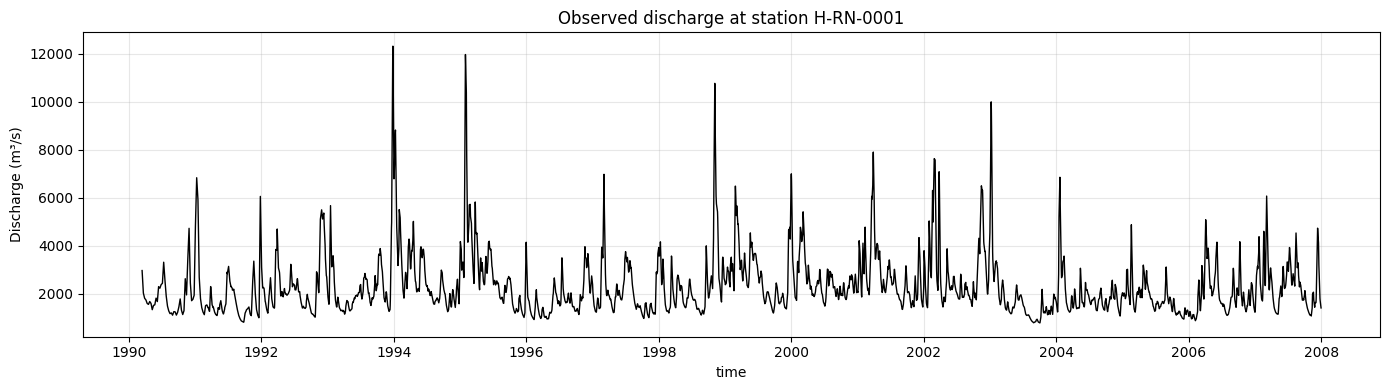
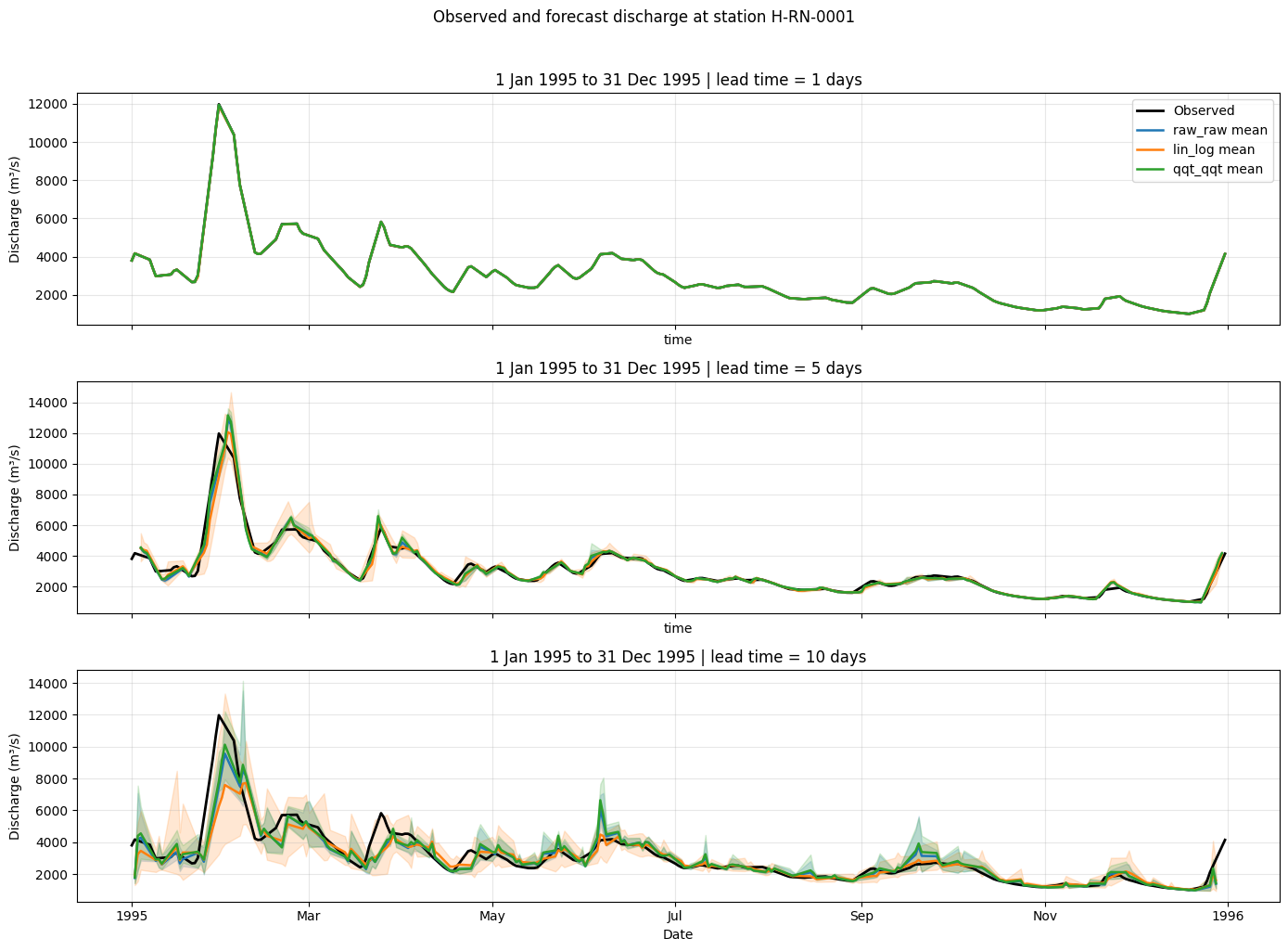
Before interpreting the verificationa and statistical results, we briefly inspect the discharge time series at Lobith.
The first plot shows the observed discharge time series using a 1-day lead time. The second plot compares observations with the ensemble mean and spread for three lead times during 1995, when a major flood event occurred in the Rhine basin.
[13]:
obs_series = select_lead_time(
    obs_da.sel(station=example_station),
    lead_days=1,
)
obs_series = use_valid_time_axis(obs_series)

fig, ax = plt.subplots(figsize=(14, 4))

obs_series.plot(ax=ax, color="black", linewidth=1)
ax.set_title(f"Observed discharge at station {example_station}")
ax.set_ylabel("Discharge (m³/s)")
ax.grid(True, alpha=0.3)

plt.tight_layout()
plt.show()
[14]:
forecast_datasets = {
    pair_id: get_forecast_data(pair_id).sel(station=example_station)
    for pair_id in forecast_variants
}


def forecast_stats_for_lead(da, lead_days):
    """Return ensemble mean, min, and max for a selected lead time."""
    selected = select_lead_time(da, lead_days)

    mean = selected.mean(dim="realization")
    lower = selected.min(dim="realization")
    upper = selected.max(dim="realization")

    return use_valid_time_axis(mean), use_valid_time_axis(lower), use_valid_time_axis(upper)


def plot_event_forecasts(obs_series, forecast_datasets, period, period_label, lead_times=(1, 5, 10)):
    """Plot observed discharge and forecast ensemble summaries for multiple lead times."""
    colors = {
        "raw_raw": "tab:blue",
        "lin_log": "tab:orange",
        "qqt_qqt": "tab:green",
    }

    fig, axes = plt.subplots(len(lead_times), 1, figsize=(14, 10), sharex=True, sharey=False)
    obs_period = obs_series.sel(time=period)

    for ax, lead_days in zip(axes, lead_times):
        obs_period.plot(ax=ax, color="black", linewidth=2, label="Observed")

        for name, da in forecast_datasets.items():
            mean, lower, upper = forecast_stats_for_lead(da, lead_days)
            mean_period = mean.sel(time=period)
            lower_period = lower.sel(time=period)
            upper_period = upper.sel(time=period)

            color = colors[name]
            ax.fill_between(
                mean_period["time"].values,
                lower_period.values,
                upper_period.values,
                color=color,
                alpha=0.18,
            )
            mean_period.plot(ax=ax, color=color, linewidth=1.8, label=f"{name} mean")

        ax.set_title(f"{period_label} | lead time = {lead_days} days")
        ax.set_ylabel("Discharge (m³/s)")
        ax.grid(True, alpha=0.3)

    axes[0].legend(loc="upper right")
    axes[-1].set_xlabel("Date")

    plt.suptitle(f"Observed and forecast discharge at station {example_station}", y=1.02)
    plt.tight_layout()
    plt.show()


year_1995_period = slice("1995-01-01", "1995-12-31")

plot_event_forecasts(
    obs_series=obs_series,
    forecast_datasets=forecast_datasets,
    period=year_1995_period,
    period_label="1 Jan 1995 to 31 Dec 1995",
    lead_times=(1, 5, 10),
)
Questions#
Use the figures above to reflect on the data before interpreting the verification results.
How does discharge vary through 1995?
What does the shaded range around each forecast mean represent?
How does forecast behaviour change with lead time?
Show suggested answers
Discharge shows variability throughout the year, with exceptionally high peaks in early 1995.
The shaded range shows the minimum-to-maximum range across ensemble members. A wider range indicates greater ensemble spread and forecast uncertainty.
Forecasts generally become less precise and more uncertain at longer lead times. This appear as larger deviations from observations and wider ensemble spread.
7. Before interpreting the verification results#
Before looking at the plots, consider the following questions.
What do you expect to happen to forecast skill as lead time increases?
Should a good ensemble forecast always have a very small spread?
Why might high-flow/flooding events be harder to forecast than normal-flow conditions?
Which criteria helps assess probabilistic accuracy?
Which metrics/criteria helps assess ensemble spread and reliability?
Show suggested answers
Forecast skill usually decreases as lead time increases because uncertainty grows further into the future.
No. A good ensemble should have an appropriate spread. If the spread is too small, observations may often fall outside the ensemble range.
High-flow/flooding events are often driven by complex rainfall, snowmelt, catchment storage, and routing processes. Small timing or precipitation errors can produce large discharge errors.
CRPS.
Rank histogram.
8. Scatter plots: observed versus forecast discharge#
Scatter plots compare forecasted discharge against observed discharge.
Points close to the 1:1 line indicate good agreement.
Points below the line indicate underestimation.
Points above the line indicate overestimation.
Increasing spread around the line indicates increasing forecast uncertainty or error.
For readability, we compare the ensemble mean with the observations for lead times of 1, 5, and 10 days. This gives a compact overview of forecast behaviour across lead times and forecast datasets.
[15]:
selected_leads = [1, 5, 10]

fig, axes = plt.subplots(
    len(selected_leads),
    len(forecast_variants),
    figsize=(12, 10),
    sharex=True,
    sharey=True,
)

axes = np.atleast_2d(axes)

for row, lead_day in enumerate(selected_leads):
    for col, pair_id in enumerate(forecast_variants):
        ds_variant = pair_datasets[pair_id]

        obs = ds_variant["obs"].sel(station=example_station)
        forecast = get_forecast_data(pair_id).sel(station=example_station)

        obs_lead = use_valid_time_axis(select_lead_time(obs, lead_day))
        forecast_lead = use_valid_time_axis(select_lead_time(forecast, lead_day))

        forecast_mean = forecast_lead.mean(dim="realization")

        valid = np.isfinite(obs_lead.values) & np.isfinite(forecast_mean.values)

        x = obs_lead.values[valid]
        y = forecast_mean.values[valid]

        ax = axes[row, col]
        ax.scatter(x, y, s=8, alpha=0.3)

        min_val = min(x.min(), y.min())
        max_val = max(x.max(), y.max())

        ax.plot(
            [min_val, max_val],
            [min_val, max_val],
            color="black",
            linestyle="--",
            linewidth=1,
        )

        ax.set_title(f"{pair_id} | {lead_day}-day lead")
        ax.grid(True, alpha=0.3)

        if col == 0:
            ax.set_ylabel("Forecast discharge (m³/s)")

        if row == len(selected_leads) - 1:
            ax.set_xlabel("Observed discharge (m³/s)")

plt.suptitle(
    f"Observed vs ensemble-mean forecast discharge at Lobith ({example_station})",
    y=1.02,
)

plt.tight_layout()
plt.show()
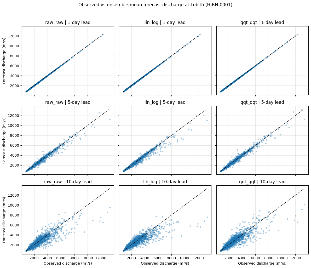
Interpretation: scatter plots#
At a 1-day lead time, all forecast datasets show strong agreement with observations. The points lie close to the 1:1 line, indicating good short-range forecast accuracy.
At a 5-day lead time, the spread around the 1:1 line increases. This indicates growing uncertainty and decreasing forecast skill. Some high observed discharge values are underestimated, especially during high-flow/flood conditions.
At a 10-day lead time, the relationship between forecasts and observations becomes weaker. The scatter increases further and high flows are more difficult to predict accurately.
Overall, the scatter plots show that forecast skill decreases with lead time and that forecast errors become larger for high discharge values.
9. Continuous Ranked Probability Score (CRPS)#
CRPS asseses how well an ensemble forecast matches the observed outcome. It evaluates the full forecast distribution, not just the ensemble mean.
A CRPS of 0 indicates a perfect forecast.
Lower values indicate better probabilistic forecast quality.
CRPS increases when forecasts are biased or when the ensemble spread does not adequately represent the observation.
Here we compute the mean CRPS at Lobith as a function of lead time for each forecast dataset.
[16]:
crps_by_variant = {}

for pair_id in forecast_variants:
    ds_variant = pair_datasets[pair_id]
    crps = ds_variant["crps_for_ensemble"].sel(station=example_station)

    # Average over forecast reference times to obtain CRPS by lead time.
    crps_mean = crps.mean(dim="forecast_reference_time", skipna=True)
    lead_name = get_lead_coord_name(crps_mean)

    lead_values = crps_mean[lead_name].values
    if np.issubdtype(lead_values.dtype, np.timedelta64):
        lead_days = (lead_values / np.timedelta64(1, "D")).astype(int)
    else:
        lead_days = lead_values

    crps_by_variant[pair_id] = pd.DataFrame(
        {
            "lead_time_days": lead_days,
            "crps": crps_mean.values,
            "forecast_dataset": pair_id,
        }
    )

crps_df = pd.concat(crps_by_variant.values(), ignore_index=True)
crps_df.head()
[16]:
| lead_time_days | crps | forecast_dataset | |
|---|---|---|---|
| 0 | 1 | 1.500894 | raw_raw |
| 1 | 2 | 7.732856 | raw_raw |
| 2 | 3 | 20.205717 | raw_raw |
| 3 | 4 | 38.658575 | raw_raw |
| 4 | 5 | 62.932173 | raw_raw |
[17]:
fig, ax = plt.subplots(figsize=(8, 5))

for pair_id, group in crps_df.groupby("forecast_dataset"):
    ax.plot(
        group["lead_time_days"],
        group["crps"],
        marker="o",
        label=pair_id,
    )

ax.set_title(f"Mean CRPS by lead time at Lobith ({example_station})")
ax.set_xlabel("Lead time (days)")
ax.set_ylabel("Mean CRPS")
ax.grid(True, alpha=0.3)
ax.legend(title="Forecast dataset")

plt.show()
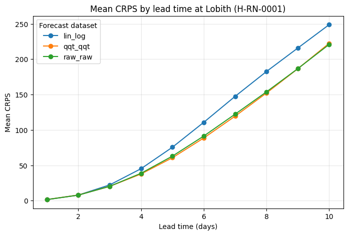
Interpretation: CRPS#
The mean CRPS increases steadily with lead time for all forecast datasets. This indicates that probabilistic forecast skill decreases as predictions extend further into the future.
At short lead times, all forecast datasets have relatively low CRPS values, indicating good short-term probabilistic performance.
At longer lead times, the differences between datasets become clearer. Lower CRPS values indicate better probabilistic forecast quality. In this case, raw_raw and qqt_qqt remain closer to each other, while lin_log shows higher CRPS values at longer lead times.
Overall, the CRPS plot confirms the expected loss of skill with lead time and shows how different post-processing approaches affect probabilistic forecast performance.
10. Rank histograms#
Rank histograms evaluate ensemble reliability and spread. They show where observations fall relative to the ordered ensemble members. For a well-calibrated ensemble, the histogram should be roughly uniform.
Common patterns:
U-shaped: ensemble spread is too narrow; observations often fall outside the ensemble range.
Dome-shaped: ensemble spread is too wide.
Skewed: forecasts may be biased high or low.
Here we compare rank histograms for the three forecast datasets and selected lead times.
[18]:
selected_leads = [1, 5, 10]

fig, axes = plt.subplots(
    len(selected_leads),
    len(forecast_variants),
    figsize=(12, 8),
    sharex=True,
    sharey=True,
)

axes = np.atleast_2d(axes)

for row, lead_day in enumerate(selected_leads):
    for col, pair_id in enumerate(forecast_variants):
        ds_variant = pair_datasets[pair_id]
        rank_hist = ds_variant["histogram_rank"].sel(station=example_station)
        hist = select_lead_time(rank_hist, lead_day)

        ax = axes[row, col]
        ax.bar(
            hist["rank"].values,
            hist.values.squeeze(),
            width=0.8,
        )

        ax.set_title(f"{pair_id} | {lead_day}-day lead")
        ax.grid(True, alpha=0.3)

        if col == 0:
            ax.set_ylabel("Count")

        if row == len(selected_leads) - 1:
            ax.set_xlabel("Rank")

plt.suptitle(f"Rank histograms at Lobith ({example_station})", y=1.02)
plt.tight_layout()
plt.show()
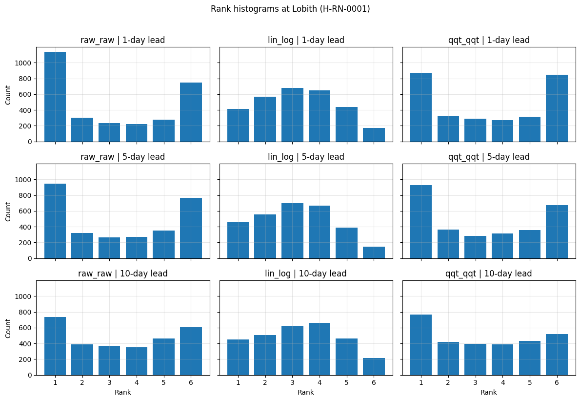
Interpretation: rank histograms#
The rank histograms show clear differences between the forecast datasets.
The raw_raw forecasts show a pronounced U-shaped histogram, especially at short lead times. This indicates that observations often fall outside the ensemble range, suggesting that the raw ensemble is underdispersed.
The lin_log histograms are flatter than those of raw_raw, especially at longer lead times. This suggests improved representation of ensemble spread, although some asymmetry remains.
The qqt_qqt forecasts also reduce the strong U-shape seen in raw_raw. The histograms are still not perfectly uniform, but they suggest improved calibration compared with the raw ensemble.
Across all lead times:
raw_rawremains strongly underdispersed.lin_logprovides the most uniform and best-calibrated rank histograms.qqt_qqtimproves calibration relative toraw_raw, but still exhibits noticeable underdispersion.
These results highlight that post-processing can substantially improve ensemble reliability, even when forecast accuracy and uncertainty still degrade with increasing lead time.
10. Bringing the evaluations together#
Each metrics/criteria tells us something different:
Metrics/criteria |
Main question |
What we learned |
|---|---|---|
Scatter plot |
Are forecasts close to observations? |
Agreement decreases with lead time, especially for high flows. |
CRPS |
How good is the full probabilistic forecast? |
Probabilistic skill decreases with lead time. |
Rank histogram |
Is the ensemble spread reliable? |
Raw forecasts are underdispersed; post-processing improves calibration. |
These metrics/criteria should be interpreted together. A forecast dataset may perform well according to one metrics/criteria but reveal weaknesses in another.
11. Reflection questions#
Why does forecast skill usually decrease with lead time?
Can a forecast have low CRPS but still have a problematic rank histogram?
What does an underdispersed ensemble mean in practice?
Why use multiple metrics/criteria instead of one?
Show suggested answers
Because uncertainty grows as forecasts extend further into the future. Errors in meteorological inputs, model states, and hydrological processes accumulate over time.
Yes. CRPS summarizes probabilistic quality, while the rank histogram specifically reflects ensemble reliability and spread. A forecast can have reasonable average accuracy but still be underdispersed.
The ensemble spread is too narrow. Observations fall outside the ensemble range more often than expected, meaning forecast uncertainty is underestimated.
Forecast quality has multiple aspects: accuracy, bias, uncertainty, reliability, and behaviour during extremes. No single diagnostic captures everything.
11. Summary#
For the Lobith discharge forecasts:
Forecast skill decreases with lead time.
Forecast errors increase for high-flow events.
CRPS confirms the loss of probabilistic forecast skill at longer lead times.
Rank histograms show that the raw ensemble is underdispersed.
Post-processing improves ensemble reliability, especially in terms of ensemble spread.
Together, these results show why ensemble forecast verification should combine multiple metrics/criteria rather than relying on a single plot or score.